If you are a prospective author please see our submission guidelines for prospective authors. The following Author's Guide is intended for contracted authors preparing their manuscript for production.
Please use the following checklists to be certain you have properly prepared the required elements of your final manuscript. A few important things to keep in mind:
- If you will be reproducing copyrighted material in your book (whether text, images, maps, etc.), you will need to submit permission documentation when you turn in your completed manuscript. Getting permissions can take months, and delays with permissions can mean delays for your book, so start the process early (after discussing it with your acquiring editor).
- If your book contains material from interviews you've conducted, you will need each of your interviewees to sign an Interview Release Form (PDF). Getting them to sign the form at the time of the interview will save you from having to go back later. If you have signed or recorded release from before signing your contract with UMPRE, it is not necessary to use our form.
- Before submitting your manuscript, please review the text for consistency in spelling, grammar, and punctuation. Please also fact-check your manuscript to ensure that all information is accurate and verify that bibliographic references are complete and up-to-date.
- We ask that you make every effort to use bias-free and gender-neutral language. You may refer to the Guidelines on Inclusive Language and Images in Scholarly Communication on the Coalition for Diversity and Inclusion in Scholarly Communications website.
- The Press places a priority on making our electronic products as accessible as possible. If your manuscript includes images or figures, you will be asked to provide descriptive text (called alt text), in addition to captions, for each image. If your manuscript includes audio, you will be asked to provide captions for each audio file. If your manuscript includes video, you will be asked to provide captions and visual descriptions for each video file. Alt text, captions, and video descriptions will make the electronic version of your book accessible to readers who have disabilities or use assistive technology to interact with digital content.
Final Manuscript Preparation
FormattingWhen formatting the final manuscript, please make sure that these steps have been followed:
___ All text is in Word .docx files with 12pt double-spaced type (including block quotations, notes, reference lists, captions, and bibliographies). The default text font to use is Times New Roman; however, sometimes additional fonts are needed in order to embed the required characters. Please see the more detailed "Fonts and Unusual Characters in Manuscripts" section.
___ Margins are 1 1/2 inch on the left and 1 inch on the top, right, and bottom.
___ Pages are numbered consecutively throughout the manuscript, starting with page 1 on the half-title page (the first page of your ms.). That is, if Chapter 1 ends on page 72, Chapter 2 should start on page 73.
___ The first line of each paragraph is indented, and there are no extra line spaces between paragraphs and chapter sections.
___ Your table of contents matches your chapter titles exactly and does not include subheads. Note: you do not need to provide page numbers on your table of contents.
___ All notes are formatted as endnotes within each chapter document and numbered with Arabic numerals. If you prefer the printed book to have footnotes rather than endnotes, please discuss this with your acquiring editor prior to submitting your final manuscript.
___ You have removed illustrations, charts, and tables and inserted “callouts” in your text to indicate approximately where each illustration, chart, or table should be placed (e.g., “<Insert Fig03.tif>”).
Authors and volume editors: please verify that this checklist has been followed in your final manuscript. Note that The Chicago Manual of Style is available online as a trial subscription; it may also be available either online or in book form from your public or university library.
- Citations in the text are listed in your bibliography/references section. Similarly, all references in the bibliography/reference section are cited in the text.
- All citations use the same style; we recommend using The Chicago Manual of Style (CMS), though ELT and Applied Linguistics authors may use APA style, but CMS is the preferred format.
- Entries in your bibliography are in alphabetical / numerical order.
- Entries contain all necessary elements, usually: author(s), publication date, title, publication, city, page number and DOI (if available).
- Works by multiple authors are cited with the appropriate number of authors’ names, and with the correct use of “et al.”
- Titles are accurate.
- Names are spelled correctly and contain the information required by the style, such as full first names or initials.
- Multiple works by the same author(s) repeat the full name(s): that is, do not use 3-em dashes instead of the full name(s).
- Ibid. is not used in notes. Instead, use author last name and page number.
- Op. cit. and loc. cit. are not used at all. Instead, use proper long- or short-form citations, according to the citation format the ms. is using.
- The number sequence for footnotes/endnotes in each chapter is correct and matches the number of notes provided.
- Source citations are present for all quoted passages that need such an attribution.
- Figures and tables are numbered correctly.
- Heads and subheads are set up consistently.
Before submitting your final manuscript, please download the Final Manuscript Submission Checklist (.docx) to ensure you have included all expected items.
When submitting the final, formatted manuscript for book production, please save frontmatter materials, individual chapters, and back matter sections in separate Word .docx files, and label them using the conventions described below.
Please use 2-digit numbers at the start of each file name, so that the files sort correctly.
Please use 00 at the start of the frontmatter text file. The frontmatter file can contain everything at the start of the manuscript up to, but not including, the Introduction. Common elements found in the frontmatter are:
- title page (including both the work’s title and subtitle, if there is one)
- dedication
- table of contents
- list of illustrations (if there are any)
- foreword, preface, and acknowledgements
Subsequent elements, and their file names, might look like this:
If there is an Introduction, begin that file name with 01. The book’s actual Chapter 1 might be text file name 02. For example:
- 00_Frontmatter.docx
- 01_Introduction.docx
- 02_Chapter01.docx
Please also follow the additional guidelines below:
___ Supply a table of contents and other frontmatter, which may include a dedication, foreword, preface, and acknowledgments.
___ Remove all non-text items from the manuscript files: these include tables, all images, and charts. Supply each image, and each chart, as a separate file, with each item clearly labeled. Compile all tables into a single .docx file with each table on a new page. Please see the section "Image, Alt Text, and Table Preparation" for file labeling instructions.
___ If physical art files are needed (e.g., photo prints), label each on the back with the illustration number and make sure they have been packaged securely and shipped to the Press. Please do not submit irreplaceable or valuable items; have these items professionally photographed or scanned, and provide the electronic files instead.
___ Please complete the Final Manuscript Submission Log. Instructions can be found in the Final Manuscript Submission Log Instructions (.docx).
___ Please include a list of captions and alt text for all illustrations (see "Image, Alt Text, and Table Preparation"), including credit lines, in a single document. For clarity, list the Figure 1 caption, Figure 1 alt text, Figure 2 caption, Figure 2 alt text, etc., all in one document. If you prefer not to have captions for your illustrations, please discuss this with your acquiring editor prior to submitting your final manuscript. You will still need alt text for each image, even if you do not have captions.
___ Supply a separate list of tables, if your book includes more than 5 captioned tables.
___ Supply a separate list of illustrations, if your book includes more than 5 captioned figures.
___ If your manuscript includes languages other than the primary language used in the manuscript, please provide a list of the languages used in the manuscript.
___ If your manuscript includes display math (e.g., formulas, equations), please explain what program was used to create them, and how many there are in the manuscript. If there are more than five, please provide samples to your editor as early as possible, so the Press can confirm that they can be edited and printed successfully.
___ If your manuscript includes poetry excerpts, please format them with correct indentation levels and line breaks and provide a PDF of the original, if possible. Doing so helps with the typesetting process.
___ If there is anything other than plain text in any part of your book, e.g., scientific formulas, mathematical symbols, diacritical marks, foreign-language accents or characters, or icons, please discuss this with your acquiring editor prior to submitting your final manuscript. See the "Fonts and Unusual Characters in Manuscripts" section.
___ If subvention or grant funding has been acquired, please submit any specific acknowledgment wording, as required by the funding body.
___ Please supply a digital PDF file of the complete manuscript. Before submitting, please check to make sure it’s accurate, especially if you have used any non-latin-alphabet languages (see "Fonts and Unusual Characters in Manuscripts"), unusual characters, musical symbols, diacritics or unusual fonts. This ensures the Press has an accurate representation of all the elements in the manuscript to refer to.
___ Please send in your completed Promotional Blueprint (PDF) to your contact in the Sales, Marketing, and Outreach department.
___ Please complete and sign the Title Approval Form.
1. Important Information for All Manuscripts:
When you are creating your manuscript, please choose a common unicode font. Good fonts to use are Times New Roman and Minion Pro; both of these fonts have very large character sets, so they can provide unicode characters for the vast majority of what is needed. Use Arial if you need a sans serif font; for example, when you need to embed the font in an illustration file.
If your manuscript needs characters that are not present in your main text font, it is acceptable to use a second font for these special characters, as long as it is also a Unicode font. If this situation arises, please discuss it with your acquiring editor to be sure you are using a suitable font.
Regardless of the font chosen, if your manuscript has many special characters or extensive use of non-latin fonts, please provide a sample to UMP early on, in both Word and PDF form, so that we can confirm that the characters are truly Unicode.
At the time of final manuscript submission, please submit a full copy of the ms. in PDF format. Please check your PDF carefully, to make sure special characters display as you intend. UMP will be relying on your PDF as the definitive guide to the intended display of characters in your manuscript.
2. If Your Manuscript Uses Classical Greek:
i) We suggest you use the Society for Classical Studies' Greekkeys package.
ii) If at all possible, please set your entire manuscript – both English and Greek – in New Athena Unicode or Times New Roman. These two fonts contain large Greek sets, including underdots. If your manuscript does not use underdots, Minion Pro has an acceptable Greek set.
iii) Please do not use an IFAO-Grec font in your manuscript. These fonts are not suitable for print or ebook publishing.
iv) We very much appreciate every effort you make in delivering your manuscript in the Unicode fonts that we request. Please be aware that there are rare and unpredictable circumstances in which an author’s Unicode font does not work for our publishing processes. In the unusual cases where that happens, we will be in touch to discuss alternatives.
3. If Your Manuscript Uses Asian Characters:
We recommend Unicode fonts, such as Adobe Song Std, Adobe Ming Std, or Adobe Han Serif TC (Traditional Chinese), which often have the characters that are needed.
4. If Your Manuscript Uses Musical Symbols in the Main Text:
We suggest you use Times New Roman for your entire manuscript; it has an extensive music character set.
In addition, if you are using the “sharp” and “flat” symbols in your manuscript, please do NOT use a “pound” sign or a lowercase “b.” Please enter the actual symbol for sharp and flat, in Word, using a standard Unicode font in Word, such as Times New Roman.
___ Please include a separate Word doc with brief (one or two sentences) biographies and academic affiliations for each contributor.
___ Please ensure that all original signed copies of the Contributor’s Agreements (PDF) have been gathered and sent to the Press. Scans of original paper documents are acceptable. Please do not submit contributor agreements one at a time.
___ Please make sure you as volume editor have completed the Promotional Blueprint (PDF), and have submitted it to your contact in the Sales, Marketing, and Outreach department.
___ Please save each contribution in a separate file, and label the files as shown below to indicate the order in which the chapter or essay will appear in the book. If a chapter has more than one author, use only the first author’s last name.
00_front matter
01_Introduction_Contributor name
02_Chapter_01_Contributor name
03_Chapter_02_Contributor name
04_Chapter_03_Contributor name
05_Chapter_04_Contributor name
06_Chapter_05_Contributor name
07_Conclusion_Contributor name
___ If you do not intend for chapter numbers to appear in the table of contents and/or chapter opening pages, please discuss this with your acquiring editor prior to submitting your final manuscript.
___ If there are illustrations in any of the essays, the volume editor should complete the Final Manuscript Submission Log (FMSL). All art throughout the volume should be accounted for in one log.
Overview: What Is Digital Art?
Naming Art Files
Alt text: What it is used for, and how to create it
Scans
Digital Photos
Screenshots
Charts and Graphs
Musical Examples
Maps
Tables
1. Overview: What Is Digital Art?
Digital art is any image that has been captured through scanning or digital photography or that has been created using a software program.
The most common types of digital art are Scans, Digital Photos, Screenshots, and Vector-Based Graphics. Scans, digital photos, and screenshots render images as a finite number of dots (called “pixels”) per inch, also called “dpi” or “resolution.” The density of those dots dictates at what size the image can be displayed on a printed page. Vector-based graphics do not have a finite number of dots, so they are “resolution independent” and can be used at any size without loss of quality.
Scans
These are digitized image files created from a physical piece of art like a print photo, article, or drawing. They are saved in graphic formats such as .tif and .jpg, and they include two main types:
Photo scans, or any drawing/chart/graph/map scans that contain gray shading
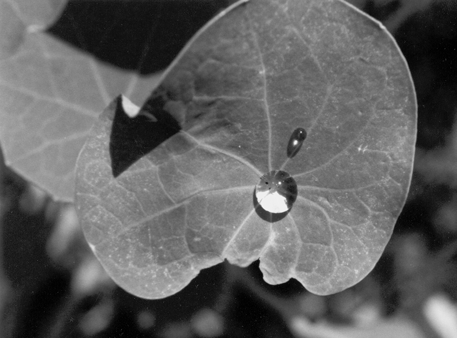
Alt text example: Black and white photograph, close-up of plant leaf with two drops of water on it.
Black and white line art or text scans that are only solid black and white
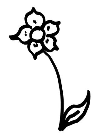
Alt text example: Simple line drawing of a flower with five petals. There is one leaf extending from the stem at the bottom of the drawing.
Digital Photos
These are images taken with a digital camera and then saved in one of various graphic formats, such as .tif or .jpg. See the section on Scans (above) for relevant alt text examples.
Screenshots
Typically these graphics are created using the screen-capture keyboard command in web browsers (command+shift+3 on a Mac and PrtScr on a PC). They are then saved in graphic formats, such as .jpg and .png. See the section on Scans (above) for relevant alt text examples.
Vector-Based Graphics
These are created from scratch using software and have been saved as .eps files. Common types of vector-based graphics include charts and graphs; musical examples and maps are often vector-based graphics as well.
Charts and graphs
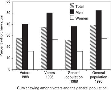
Alt text example: Bar graph comparing percentage of gum chewers among voters with the percentage of gum chewers among the general population in 1988 and in 1996. Percentages are shown for the number of men and women in each group and for each group as a whole.
Musical examples
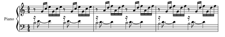
Alt text example: The first three measures of Prelude I in C Major, BWV 846, by Johann Sebastian Bach (1685-1750), scored for piano.
Maps
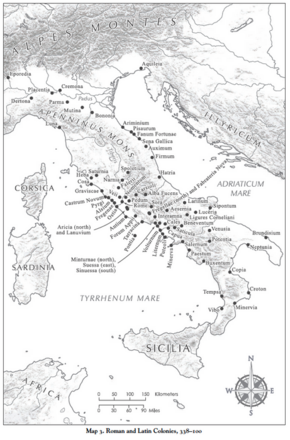
Alt text example: Map identifying 70 Roman and Latin colonies in the period 338-100 BCE, in present-day Italy.
Note that when UMP receives art that is in color, typically it is converted to grayscale as a default setting for books. Therefore, it is important to check shades of color in any images to make sure that the colors still show variation once they are converted.
2. Naming Art Files
Overall guidelines for all projects
Please ensure each file name is between 5 and 25 characters long.
Do not add spaces or periods; use underscores instead.
Do not add hyphens or any other punctuation, other than the period before the file extension.
Do not include any special characters or characters from a non-latin font.
Tables are not art, so they should be numbered separately from other images. Additionally, tables should not be listed in the Final Manuscript Submission Log, unlike actual art files.
Use “Fig” for any art other than maps, plates, or music (see below).
Add zeros with the numbers to help them fall in the right order when displayed in a program like Windows Explorer. Add one zero if there are 0 to 99 pieces of art, two zeroes if there are 100 or more pieces of art.
E.g.:
- Fig01.tif (if there are 99 or fewer pieces of art)
- Fig001.tif (if there are 100 or more pieces of art)
- Fig04_01_Clark.tif (Meaning, figure 1 in actual text chapter 4 of an edited volume, with the chapter author name being Clark. Even if the edited volume overall has more than 99 pieces of art, as long as each chapter has less than 99 you do not need to add more than one zero.)
If an illustration has more than one part, please add “a,” “b,” “c,” etc., as needed, right after the figure, plate, map, or music number.
For instance:
- Fig04_01a_Clark.tif
- Fig04_01b_Clark.tif
- Music01a.tif
- Music01b.tif
Additional numbering information for monographs
Art files for monographs should be numbered consecutively. Filenames should not include chapter number or other elements.
For instance:
- Fig01.tif
- Fig02.tif
- Fig03.tif
- Fig04.tif and so on
Additional numbering information for edited volumes
Please include in the file name BOTH the name of the chapter’s author, AND the chapter number, AND the figure number – but in reverse order, for clarity, as seen below.
When naming files with chapter and figure number, please remember to add the necessary zeroes so the file names sort correctly.
For instance:
- Fig03_04_Clark.tif
This filename represents Chapter 3, figure 4, in Clark’s chapter. And see how easily a series of files will sort in a file list when numbered this way:
- Fig01_04_Clark.tif
- Fig02_04_Clark.tif
- Fig03_04_Clark.tif
3. Alt text: What it is used for, and how to create it
Alt text – “alternative text” – is a short description (often 140 characters or fewer) of a visual item like a map or a picture. It is used in digital presentations of text, like ebooks or websites. Alt text is a specific visual resource that is not displayed on the digital page but is embedded in the electronic book or web page and can be accessed via assistive technology. Alt text will make the electronic version of your book accessible to readers who have disabilities or use assistive technology to interact with digital content.
Examples are provided for each type of art discussed here. Alt text is similar to a caption, but intended to be more purely descriptive. Alt text is supplementary to the caption and should not repeat the same information. Please be sure to provide alt text with each caption. For other examples and instructions on writing longer descriptions, please see the Describing Visual Resources Toolkit or our resource for writing image descriptions.
4. Scans
Scans are digitized image files created from physical items, such as print photos, slides, or original art. Typically such scans are provided to authors by the copyright holder, and not created by authors themselves. In rare cases in which authors need to create their own scans, use these guidelines.
Scan Types
(a) Photo or Gray-Shaded Scans: If the original is a photograph or an item that contains gray shading (not just solid black), the original should be scanned as “black and white photo,” which may be called “photo,” “continuous tone,” or “grayscale” in your scanning program. Scanning software typically allows the user to select a portion of any larger scanned image, when appropriate.
(b) Text or Line Art Scans: If your original is a drawing/chart/graph/map/text/article/score without any gray tones in it and consists only of solid black and white, the original should be scanned as “text” (which may be called “bitonal” or “bitmap” in your scanning program), at a much higher resolution (see below). In these scans, each pixel has only one of two values: 100% black or 100% white. Scanning software usually has a selection tool, so ideally you will adjust the selection window so that it frames only the item on the page that you need to scan, if it’s within the context of a larger image.
What We Need From You
(a) Photo or Gray-Shaded Scans that Are Not Previously Printed:
- 300 dpi at 5 inches wide or more if it’s horizontal, or at 8 inches high or more if it’s vertical.
- Saved in .tif (best), .jpg, or .png format.
(b) Previously Printed Photo or Gray-Shaded Scans:
- 600 dpi at 5 inches wide or more if it’s horizontal, or at 8 inches high or more if it’s vertical.
- Check the box for “Descreen” if the scanning software gives you that choice; if not, don’t worry about it.
- Saved in .tif (best), .jpg, or .png format.
(c) Text or Line Art Scans:
- 1200 to 2400 dpi at 5 inches wide or more if it’s horizontal, or at 8 inches high or more if it’s vertical.
- Saved in .tif (best), .jpg, or .png format.
Keep in Mind
- If the original looks bad, the reproduction will be as bad or worse, even if you do have it scanned at the ideal resolution.
- Do not artificially “add” resolution into a scanned image in Photoshop after the scanning has been done.
- If you scan anything with gray tones in it, from a source that is previously printed, the “descreen” function means that your final image will be slightly blurred. In addition, UMP may need to blur it more than what your scanner was able to do. This blurring is necessary, in order for your previously printed image to print successfully.
- If the scanned or digitally photographed file you receive from the art holder is in color, UMP will convert it to black and white in-house. Please be aware that colors of the same value, such as a dark red and a dark blue, may no longer be distinguishable when converted to gray, so if the color changes indicate something essential in the image, a different image might need to be chosen.
- If your project has a large trim size, images will need to be scanned larger than these default sizes. Doubling the requested sizes should be sufficient for most images.
- If your project has art that you have agreed with your acquiring editor will print in color, the above instructions apply, except you will scan the photo in the “color photo” or “color” mode in your scanning software.
5. Digital Photos
Digital photos are images taken by a digital camera. As cell phone cameras improve in quality, sometimes authors take photos using their cell phones instead of a camera. If you must use a cell phone, make sure its camera resolution and resulting photo dimensions are suitable.
What We Need from You
- Images should have a density of at least 300 dpi at 5 inches wide or more.
- File is saved in .tif, .jpg, or .png format.
Keep in Mind
- Photos should be of good contrast, clarity, and focus. If the original looks bad, the reproduction will be worse.
6. Screenshots
Screenshots are created using the screen-capture function in web browsers; they are very rarely of sufficient quality for print.
If there is no other option, and a screenshot must be used:
What We Need from You
- Use the largest monitor you can, with the item/web page as large on that monitor as you can, when you take your screenshot. Provide the screenshot to UMP in that original format.
Keep in Mind
- UMP may still determine that your screenshot is not usable. (UMP will shrink it down and determine if it hits a bare minimum resolution for printability, or not.)
- Video stills can also be created in Photoshop, and may be of high-enough resolution, ideally 300 dpi at 5 inches wide. (Video stills created via screenshots will rarely be of high-enough resolution.)
7. Charts and Graphs
Charts and graphs ideally are created from scratch, in vector-based software applications, such as Microsoft Excel or Adobe Illustrator.
If the chart or graph exists only as a hardcopy, please see details about scanning. UMP may require you to redraw the art if it does not meet quality requirements.
What We Need from You
- Please submit a sample of your charts or graphs before you submit the final book files for production, so that the sample can be examined for any production issues. This is a very important step, and can reduce or remove issues that might appear later.
- We accept charts and graphs created in vector-based software, in file formats such as .eps, .pdf, Word (.docx), and Adobe Illustrator files (.ai).
Keep in Mind
Guidelines for all charts/graphs:
- Type size: If you are working on a chart that is very large, make sure you reduce it to the size it will be in your book, about 4.5 inches wide, so you can see if your fonts are large enough. If you are working on a chart that is close to the final print size, 8pt to 10pt is a good font size. Don't use different sizes of type - keep the type size consistent and at a size that will be readable at 4.5 inches wide.
- Fonts: please use Helvetica or Arial, or Times New Roman. Do not use Calibri or Cambria. Do not use all caps. Type should not run over lines or over other text. Use only one font if possible; two at the most.
- Do not use colors other than gray/black. In a printed book, colors will become shades of gray that may look quite similar.
- Tints: use tints sparingly. If you must use more than one shade of gray, use 20%, 50%, and 80%. Consider using other “fills” such as dots or diagonal lines to help distinguish them.
- Black type should not be put on top of any tints darker than 20%.
- White type should not be put on top of any tints lighter than 40% and should be bold to ensure legibility. In general, please avoid using white type.
- All text, graph/chart rules, and axes should be 100% black, rather than gray, so that they will print sharply. The line width should be between .75pt and 2pt. If you are not able to use 100% black, then the line width should be 1 to 2pt. If the line is 100% black, then a line width of 0.75 pt is fine.
- It is best to save your chart or graph as an .eps file or a .pdf file directly from the working source file.
8. Musical Examples
Musical examples should be created from scratch in vector-based software applications like Sibelius or Finale.
If the musical examples exist only as hard copy, please consider scanning them.
What We Need from You
- Please submit a sample before you submit the final book files, so that it can be examined for any production issues. We accept musical examples in .eps (preferred) or .pdf file formats. We accept .tif files if there are font problems with the .eps or .pdf files. For both .eps and .pdf file types, it is important that you embed the fonts when you are creating the file type.
- If for some reason these formats are not usable in book production and you must export them as .tif files, the .tif files need to be at least 1200 dpi.
Keep in Mind
Guidelines for musical examples:
- It is best if all elements are in 100% black, no shades of gray.
- Consider the eventual width of the book’s pages (consult your acquiring editor for details): keep the width of musical examples sized so that all elements remain legible.
9. Maps
Maps should be created from scratch, in vector-based software applications, such as Adobe Illustrator, Adobe Photoshop, and GIS-based applications.
Maps must be submitted in digital format, either created in one of these programs or scanned at high density (300 dpi or better) from an original.
What We Need from You
- Please send us a sample of the art you are creating ahead of time, so we can check it and alert you to any issues.
- We accept maps created in vector-based software as .eps (best) or .pdf (second best) files. We accept .tif files if there are font problems with the .eps or .pdf files. For both .eps and .pdf file types, it is important that you check to see what font-embedding or font-outlining options you have in your software and embed the fonts when you are creating the file type.
- If for some reason these formats are unsuccessful and you need to export them as .tif files, the .tif files need to be at least 1200 dpi.
Keep in Mind
Guidelines for map creation:
- Keep in mind the book’s trim size: the map will most likely be printed around 4.5 inches wide, so make sure the elements within the map will not be illegibly small. Good sizes for fonts are 8pt up to 10pt. Do not use type smaller than 7pt.
- Tints: if you need to use more than one shade of gray, they need to be sufficiently different from each other to be distinguishable. Use 20%, 50%, and 80%.
- Do not use colors other than gray/black.
- One consistent line weight, of 1/2pt to 1pt, is preferred; use no more than two different line weights.
- Black type should not be placed on top of any tints darker than 20%.
- White type should not be placed on top of any tints lighter than 40% and should be bold to make sure it is legible. (However, it is better to avoid using white type whenever possible.)
- Fonts: please use Helvetica, Arial, or Times New Roman. Do not use Calibri or Cambria. Use all-caps sparingly, and only if necessary. Type should not run over lines or over other text. Use only one font if possible; two at the most.
- It is best to save your chart/graph as an .eps file or a .pdf file.
10. Tables
Tables can present some challenges for the typeset page, and some additional unique challenges for any electronic versions of your work. Some ebooks are read on small mobile devices that have screens that are too small for wide tables. In addition, UMP prioritizes setting tables as “live” text rather than as graphics in our reflowable-text ebooks in order to make the content more searchable, usable, and accessible.
For maximum usability by readers of your work, regardless of whether the format is print or electronic or both, here are some elements to consider when creating your tables:
If the material you are discussing could be integrated into the text, perhaps by reworking some of it into regular text, and/or some as a numbered list or a two-columned list, instead of pulling the information out separately into a table, please choose to integrate the information into the text.
Tables are not art, so they should be numbered separately from other images. Additionally, tables should not be listed in the Final Manuscript Submission Log.
Use “Fig” for any art other than maps, plates, or music (see below).
Add zeros with the numbers to help them fall in the right order when viewing all the art in a file-display program like Windows Explorer. Add one zero if there are 0 to 99 pieces of art, two zeroes if there are 100 or more pieces of art.
For instance:
- Fig01.tif (If there are 99 or fewer pieces of art)
- Fig001.tif ( If there are 100 or more pieces of art)
- Fig04_01_Clark.tif (Meaning, figure 1 in actual text chapter 4 of an edited volume, with the chapter author name being Clark. Even if the edited volume overall has more than 99 pieces of art, as long as each chapter has fewer than 99 you do not need to add more than one zero.)
Art that is to be used in a gathered art section (also referred to as an “insert” or “plate section”) should have a separate numbering sequence from any art that is placed throughout the text.
For instance:
- Plate01.tif
If a book has more than one gathered art section, then please add letters, A, B, etc., after the word “Plate” to designate each section.
For instance:
The art in the first plate section would be:
- PlateA_01.tif
- PlateA_02.tif
And the art in the second plate section would be:
- PlateB_01.tif
- PlateB_02.tif
If the ms. will have plates that contain more than one image,
Maps and musical examples may be numbered in sequence with other illustrations, following the naming conventions above. Alternately, they may be numbered separately, starting over from “01,” using “Map” or “Music” instead of “Fig” in the file names.
For instance:
- Map01.tif
- Music01.tif
A key element of a “simple” table is one that does not have too many columns across and one in which column content is brief. It is better to split your material into multiple tables with two to four columns across each than to create one large table with five to eight columns across. In addition, the more concise your columns, the better, because the table columns will be compressed when displayed on small mobile devices.
Do not use gray shading or graphic elements in your tables, since they will disappear in the digital version.
Examples
This table has only 2 concise columns. The table will do very well in an epub.
This table has 5 columns, which can sometimes be acceptable if the columns are concise. This table will be readable on most devices.
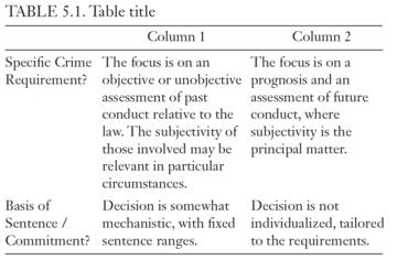
This table has 7 concise columns. Therefore, this table will be readable only on larger devices; the table is wide enough that when small mobile devices compress the content to fit, the columns may get too compressed to read.
This table has only three columns, but the columns are very wordy. This table will be readable on larger devices. On small devices the columns will be squeezed, and the type may break into narrow columns that are difficult to read.
Quick Start Summary
If your project includes videos
In order of preference, please deliver your video files in one of the following formats:
- MPEG-4 (.mp4 ONLY)
- Quicktime (.mov)
- AVI (.avi) formats
Video files should not exceed 2 GB each
Resolution: 1280x720 (720p)
Framerate: 30 fps
Video bitrate: 1500 kbps, Audio bitrate: 125 kbps
Video codec: H264, Audio codex: AAC
Please note that all video files must be logged on your Final Manuscript Submission Log. If you have questions about how to complete this document, please contact your acquisitions editor.
In addition to submitting your video files with your final manuscript, you will also need to create (or work with a third party to create) and submit the following materials:
- Captions in WebVTT format
- Visual Description in WebVTT format
Details about how to create captions and visual description in WebVTT format are covered in the Audio/ Video Guidelines for U-M Press Authors document.
If your project includes audio files
In order of preference, please deliver the highest quality version of your audio in:
- Wave (.wav)
- MPEG 3 (.mp3)
Aim to have audio files less than 2 GB.
Please note that all audio files must be logged on your Final Manuscript Submission Log. If you have questions about how to complete this document, please contact your acquisitions editor.
In addition to submitting your audio files with your final manuscript, you will also need to create (or work with someone else to create) and submit the following materials:
- Captions in WebVTT format
Details about how to create captions in WebVTT format are covered in the Audio/ Video Guidelines for U-M Press Authors document.
What Material Needs Permission?
It is your responsibility to obtain permission to use copyrighted material, such as artwork (including figures and tables not of your own making), prose, poetry, lyrics, music, diaries, letters, and maps. Given the complexities of copyright law, we are limited here to mentioning just some of the most common issues. For more extensive information about permissions, please consult the AUPresses Permissions FAQ.
You do not need permission to use something that is in the public domain. Works published in the US over 95 years ago are in the public domain, along with published works whose authors died over 70 years ago. Other works may also be in the public domain for failing to comply with formalities that were once required. The Cornell Copyright Term and the Public Domain chart provides more information for determining when works enter the public domain. It is important to remember that these rules are for the US only; other countries have different and sometimes more stringent copyright protections.
If the work you want to use is not in the public domain, you may still be able to use it if your use is a fair use. Fair use permits limited reproduction of copyrighted material for certain favored purposes, including “criticism, comment, news reporting, teaching (including multiple copies for classroom use), scholarship, or research.”
The copyright code (17 U.S.C. § 107) establishes four factors that must be used in determining whether a particular case qualifies as fair use:
- the purpose and character of the use, including whether such use is of a commercial nature or is for nonprofit educational purposes;
- the nature of the copyrighted work;
- the amount and substantiality of the portion used in relation to the copyrighted work as a whole; and
- the effect of the use upon the potential market for or value of the copyrighted work.
The Chicago Manual of Style discusses fair use in detail, at 4.84-94 (17th edition).
If the image or text passage you would like to use is not in the public domain, and if your use of the work is not a fair use, you should request permission.
Whom Do I Contact for Permission?
If you are reprinting an essay of your own that has been previously published in a periodical (including academic journals), either in its current form or in an earlier version, you must obtain written permission from the publisher (most publishers will grant this material free of charge). If you retained copyright to the work, we ask for some verification of this, either a note from the publisher or a copy of your original agreement. Be aware that even if you did retain copyright, the periodical may request acknowledgment of prior publication in the credit line.
When seeking permission for published images or other items, start with the publisher or the museum or institution that holds the work in question. When in doubt, you can try searching the Library of Congress online database of copyright records.
For music, you can also use the databases maintained by BMI and ASCAP.
For fine art and photographs, contact the museum or institution that owns the artwork. For more recent artists and art works, please contact the artist’s estate or agent. Stock photographs are generally the property of their respective image bank.
For personal photographs not taken by you, you’ll need permission from the photographer.
If identifiable individuals appear in a photograph and if they are not public figures, you will need their permission as well.
For unpublished letters, diaries, or archival materials, you will need permission from the author or the author’s estate.
What Type of Permission Do I Need?
Please make your permission request using our standard Permission Request Forms (Cover Images | Images | Texts). If the copyright holder insists on using its own form, please ask your acquiring editor to review it to make sure that they have granted all the rights you will need for your book. In most cases, that means “nonexclusive world rights in all languages and for all future editions, including electronic editions.” An email will suffice if it grants nonexclusive rights for both print and ebook use. If the copyright holder you have approached does not hold all the rights you need, you may need to approach a second copyright holder. For instance, a publisher might be able to grant only North American rights, because another publisher holds the rights to the material for the rest of the territories of the world.
Please note: because we often publish in both print and digital formats, it is especially important to secure digital rights along with print rights. Please pay particular attention to this as you are requesting permissions. We acknowledge that including digital rights may represent an additional financial burden for you, and we very much appreciate your help.
If you are unable to secure digital rights, please mention this to your acquiring editor. In particular, some European museums are unwilling to grant digital rights unless the publication will be paywalled, and UMP volumes included in our Ebook Collection are not considered to be paywalled.
Credits and Acknowledgments
Please pay close attention to the language specified in your permissions agreements regarding any credit required in order to use the copyrighted material. Please make sure to use this exact language in your acknowledgments, notes, and/or captions. Check this language for accuracy when you receive your copyedited manuscript.
What If This Is an Edited Volume?
Permission to use a contributor’s chapter
Editors of volumes containing sections by contributors other than themselves must collect and submit individual Contributor’s Agreements (PDF) signed by each contributor to the volume. This form verifies that the author is the sole copyright owner of their original contribution and transfers copyright to the Press; if the work has been previously published, we must have written permission from the publisher to reprint it.
This form also provides contributors’ mailing addresses – the address to which we will mail contributors’ gratis copies of the completed book. If a contributor moves during the course of book production, it is the volume editor’s responsibility to send an updated address to the press, or the contributor will not receive a copy of the book.
Permissions to be secured by contributors
If contributors to a volume use any permissionable material, they must secure permissions for that material and submit those permissions to the volume editor. The volume editor in turn will gather all those permissions and submit them to the press, in one group, together with the formatted manuscript.
Form Bank
Form Bank- Final Manuscript Submission Log (.xlsx)
- Final Manuscript Submission Log Instructions (.docx)
- Final Manuscript Submission Checklist (.docx)
- Title Approval Form (.docx)
- Contributor’s Agreement (PDF)
- Interview Release Form (PDF)
- Image Permission Template (PDF)
- Image Permission Template (.docx)
- Cover Image Permission Template (PDF)
- Cover Image Permission Template (.docx)
- Text Permission Template (PDF)
- Text Permission Template (.docx)
- Promotional Blueprint (PDF)
Production Process
Production and SchedulingAfter you submit the final approved manuscript, your acquiring editor and editorial associate will prepare it for the next stages in the production process. This may take a few weeks. Prior to formal transmittal, our colleagues in Production will review the manuscript text files and will make sure that all art files are suitable for reproduction. If there are any questions or concerns at this stage, your acquiring editor or editorial associate will let you know.
Once in the Production department, the manuscript is assigned to a production editor, who will begin working with your manuscript. Your production editor will contact you and give you a general overview of the production process, including a projected schedule for the various editing and proofing stages of the process. Our XML-first workflow includes in-depth tagging. The tagging adds in some extra preparation time at the beginning of the process but pays off in later stages of production. Once the tagging is complete, your manuscript will be assigned to a copy editor. Copy editing itself is generally scheduled to take between four and six weeks, depending on the length and complexity of the manuscript and the Press’s overall workload. The copy editor will edit the manuscript files electronically for spelling, grammar, consistency, cross-referencing, sentence structure, and style. Style includes capitalization, punctuation, hyphenation, treatment of numbers, and notes and bibliography or references. We generally follow the conventions of The Chicago Manual of Style (latest version) but may also follow MLA or other styles.
The copyedited files will be sent to you to review, to answer any queries, and to return to your production editor within three to four weeks. This is your last opportunity to make changes without charge. Minor changes and corrections, along with short comments and answers to the copy editor’s questions, should be indicated right in the edited files. If you make a change, such as in the spelling of a name, do so consistently throughout. We will not reread the manuscript when you return it, but we will review the manuscript for your changes and responses to questions.
It is important to meet the deadlines given to you. A delay of a few days may result in a loss of weeks in the typesetter’s or printer’s schedule. If you know in advance that you will be unavailable at a certain time, please let your production editor know.
The edited manuscript is set directly into the page proofs. You will have a chance to read the page proofs. Generally, you should expect to receive the page proofs within two to three months from when you return the copyedited manuscript. If your book will have an index, the index should be created at this stage, as the page proofs will reflect the pagination that will appear in the published book. If you know that you will be using a professional indexer, it is best to contact this person directly after you have returned your edited files. Most indexers schedule projects a few months in advance, and this is the best time to coordinate when your project's index will be created.
As volume editor, you must be prepared to resolve any questions raised by the copy editor and to contact contributors if you find it necessary. We will send the copyedited essays to you, and you will ultimately be responsible for the factual accuracy, consistency, and good taste of the essays. When you send the contributors the edited manuscript or the proof of their chapters, you will be responsible for making sure they return the manuscript to you with their corrections in time for you to meet your deadline. We ask that you transfer the contributors’ corrections onto your complete manuscript or set of proof and return it to the Press.
You will have three to four weeks for proofreading the page proofs. The proof will be sent to you electronically as a PDF, along with instructions on how to indicate errors or corrections. Read the page proofs word for word and answer any queries. Check cross-references and note numbers again.
Please be aware that alterations on proof can be very expensive. See your contract for the terms of charges for making alterations on proof. (This does not include the correction of typesetter’s errors.)
Since most of our authors are responsible for producing the index for their books (consult your contract if you’re not sure), it’s a good idea to talk to your acquiring editor about it early in the process. Your editor may have preferences with regard to length or style that you’ll want to keep in mind.
You should compile the index at the same time as you are reviewing the PDF of the page proof. Specific indexing instructions will be sent to you by the production editor for your book regarding the desired length and scope of the index. When the index is completed, a Microsoft Word file of the index should be emailed to the production editor along with any page proof corrections. If you will be hiring an indexer, please be sure to schedule the work so that the index can be returned with the page proof corrections. If you would prefer to hire a professional indexer, your acquiring editor or production editor will be happy to share our current lists of professional indexers.
We have written up a set of instructions on index creation. Please use these instructions if you are creating your index yourself, and, please pass them along to your professional indexer if you are hiring the index out.
Additionally, you can consult The Chicago Manual of Style and the American Society for Indexing for further guidance.
After you have returned your page proofs, it will be corrected by the typesetter and changes will be checked by University of Michigan Press staff. If your book has an index, the index will be edited and typeset during this time.
Cover, printed case, or jacket copy is prepared early in the production of your manuscript, based on the promotional information you provide in your Promotional Blueprint (PDF).
The front cover design will be done very early in the production process, to assist with the marketing department's promotional efforts for your book. Therefore, your suggestions regarding the design of the jacket or printed case (for hardbound books) and cover (for paperbound books) are needed at the time you submit your manuscript to your acquiring editor. This should include actual files of images that you are suggesting for the cover. Keep in mind that book covers require large, high-resolution original art files to print effectively. Book covers are an important tool for selling and promoting your book, so cover images cannot be used on a fair use basis; written permission is always required to use an image on the cover of a book, unless the image is in the public domain.
We appreciate your input and take your ideas seriously. Your art ideas will be discussed by the marketing department, which has the final say in all art choices. Then your editorial associate will get back to you with the decision, so that the art can be purchased and permissions finalized right away. You will be shown a version of the cover design when it is completed.
Marketing and Sales
Marketing Your BookA marketing campaign for your book begins in advance of publication. The Marketing Department will use the information you provide to develop review lists, flyers, conference and exhibit appearances, targeted emails and social media marketing, and opportunities for print and digital advertising. This information is gathered via the Author’s Promotional Blueprint, which provides the foundation of our efforts to target the best possible market opportunities for your book, so thorough answers on this document are essential. Please also continue to send the marketing team information about new speaking events and possible sales leads as marketing efforts continue, using this email address: um.press.mktg@umich.edu.
When the time comes, the publicity manager assigned to your book will send you the Author Promotional Blueprint via email. You will see that it is broken up into questions about your own contacts, potential review publications, awards, exhibits, conferences, and web marketing information. Please contact your publicity manager with any questions as you complete the form. Using this form and conversations with your acquiring editor, your publicity manager will build a promotional plan for your book and send it to you for review before publication.
An official publication date is set once bound books arrive in the warehouse; this date depends on a variety of factors, including our marketing plan for the book. At publication, books are sent to review outlets, complimentary copies are mailed, and books are deposited at the Library of Congress for copyright registration.
For more detailed information about the marketing of your book and resources for how to publicize your book as the author, browse this Google folder of Author Marketing Resources.
Royalties are calculated annually (January 1 to December 31). The statements will be mailed, or made available electronically, no later than March 31. Payments will be mailed under separate cover by March 31 and are mailed to the address we have on file for you. Therefore, to ensure you receive your royalty statements and payments, please notify your acquisitions editor if your address changes after you sign your contract. Refer to your contract for specific royalty arrangements.
Books can be ordered directly from our website. Please contact your marketing representative about your author discount code. For more information about purchasing books, see our Customer Service page.
Guidelines for Indexing
We’re delighted you have chosen the University of Michigan Press as your publisher and we look forward to working with you. We hope these guidelines below will help ensure you have an excellent index for your book.
Authors Are Responsible for the IndexAuthors are responsible for index preparation, which takes place concurrently with proofreading the master page proof. Although you may choose to prepare your own index, UMP encourages authors to hire professional indexers; please ask your acquiring editor or your production editor for a list of names.
Hiring and paying a professional indexer is generally the author’s responsibility (please check your contract for specifics). The decision whether to hire an indexer should be made early in the production process; please select your indexer, and make arrangements with him or her, well in advance of receipt of page proof. Staying on schedule is crucial for both proofreading and indexing. Failure to maintain your book’s schedule will delay publication of your book.
If you are an author preparing your own index, please refer to The Chicago Manual of Style, 17th edition (CMS 17), chapter 16, “Indexes.” UMP generally follows CMS style for indexing. The following guidelines are intended both for authors and for professional indexers. They address the basics of UMP indexing style and formatting.
When to Start Creating an Index
You do not have to wait for your book’s page proofs (which contain page numbers) to arrive—start to think about index entries when you have completed the final draft of your manuscript. The index is always the last part of the book to be put together, and submission of your final index copy will be subject to a tight deadline. Preparing it now may save you time later on.
Go through a copy of your manuscript, highlighting words you want to include. Make a list of these words. A good place to start is from headings and subheadings, and move on from there.
Keep the highlighted manuscript and your list to one side until you receive the master page proof PDF from your production editor. When you receive the page proof PDF you can use the “Find” function to locate your highlighted words.
The length of the index can be critical to the book. Discuss any length restrictions with your acquiring editor and your production editor. Before a book goes into production, UMP makes marketing and financial plans for the book that depend upon book features, such as size, number of images, tables, etc. If an index comes in over the anticipated length it can pose difficulties. The average index length is eight (8) master proof pages. This is approximately equal to twenty-four (24) single column double-spaced pages. If your acquiring editor or production editor tells you there are only five pages for the index and you send in fifty (50) pages of single column double-spaced entries the production editor will return the index to you to shorten. Some books have more than one index. (See Types of Indexes.)
This is an important factor. As the index should be concise and to the point, it should only reference what is relevant—not every single item, as this can actually damage the usefulness of the index.
The length will be governed in part by the number of pages available to contain the index. This varies from book to book. Your production editor will let you know approximately how many pages there are available.
Most scholarly books have only one index, containing names and key terms or concepts (a conceptual index, or general index of subject matter). In UMP Classics/Archaeology books, however, it is generally preferred to have an index of sources and a general index, with the title of each index often appearing in Latin. The indexes in these books might include, for example, an index of classical citations (Index Locorum) and an index of names or a general index (Index Nominum or Verborum). If you feel your book needs more than one index, consult with your acquiring editor well in advance.
Ask yourself the following questions for each entry:
- Is the entry a term readers are likely to look up? If there is an alternative, consider whether you should use it instead or as a cross-reference (notes on cross-referencing follow).
- Is the entry helpful to the reader?
- Is it necessary?
- Is it relevant?
The answers to these questions will help you to keep your index concise. Passing mentions and citations should not normally be indexed, nor should preliminary pages such as the Contents or Acknowledgments. Notes are generally not indexed unless they contain substantive information to the text (an exception is books that contain an Index of Passages Cited, which normally include passages that have been cited in the notes as well as in the text).
In short, it is the pages that contain significant discussion and mention of important themes, authors, titles, etc., which should be referenced. Remember that an index is not a concordance; selectivity in deciding what to include will assist readers in finding information and will make for a stronger index.
Above all, be consistent in the style you use. UMP will follow the author’s style of how they created the index, so be consistent in your style. UMP does have the option to stylize the index if the author has not been consistent or UMP feels the style is too avant-garde, but will not take the time to redo the index. If the index is found to be lacking, confusing, or with no apparent style, UMP reserves the right to return the index to the author to make it consistent and a useable tool.
After receiving your page proof PDF you should return to your already-prepared list of words.
Use the “Find” function to locate the terms you want in your index. The time lapse between compiling your original list and adding page numbers will help you to evaluate your designated entries once more.
We would like to receive your index by email. It should be a Word document, sent as an email attachment. The document should be presented double-spaced in single-column format. Please indent turnover lines, but do not use any other kind of special formatting (i.e., tabs, columns). We will create the hanging indents in-house.
Indexes are generally formatted in flush-and-hang (or hanging-indention) style. The first line of each entry is set flush left, and any following lines are indented. When there are subentries, you must choose between run-in or indented style.
UMP prefers run-in style indexes. Sometimes it is necessary to have indented style. When an indented style index is necessary, please limit the use of sub-subentries. Sub-sub-subentries are strongly discouraged. You can create a run-in style index and have only a few entries with indented style. This is often necessary when discussing an author and a particular work. Examples of the two styles follow.
Run-in Style Index
audience, 3, 11, 23–24; academic and professional, 63; alternative, 159; authentic, 58, 59;
supportive, 211; target, 107, 109
Santiago, Wilfred: In My Darkest Hour, 2, 12, 16, 90; In My Darkest Hour, embodiment in,
91–92, 103
Indented Style Index
audience, 3, 11, 23–24
academic and professional, 63
alternative, 159
authentic, 58, 59
supportive, 211
target, 107, 109
Santiago, Wilfred
In My Darkest Hour, 2, 12, 16, 90
embodiment in, 91–92, 103
Lowercase the first letter of every entry unless a proper noun. Alphabetize letter by letter, including subentries (see Chicago Manual of Style, 16th ed., section 16.56, p. 831). Alphabetize by the first important word (words such as and and short prepositions such as of do not count).
Macintosh apples, 20
McCoy, Heather, 30–32
McDonald, Russell, 200–201
Museum of Modern Art, 188
museums, 188
shortening, 2–3
St. Paul, 203–4
Washington, George, 150–51
Washingtonians, 100, 104
Washington Post, 89
Washington state, 72
“See” references following a main heading. When a see reference follows a main heading, as it usually does, it is preceded by a period and See is capitalized and italicized. If two or more see references are needed, they are arranged in alphabetical order and separated by semicolons. They reflect the capitalization and word order of the main heading.
adolescence. See teenagers; youth
“See” references following a subheading. When a see reference follows a subheading it is placed in parentheses and see is lowercased and italicized.
data processing, 22, 56, 78; tagging for typesetter (see typesetting: tagging)
“See also” references. See also references are placed at the end of an entry when additional information can be found in another entry. In run-in indexes, they follow a period; in indented indexes, they appear on a separate line. See is capitalized, and both words are in italics. If the cross-reference is to a subentry under another main heading, the words see also under may be used. If two or more see also references are needed, they are arranged in alphabetical order and separated by semicolons. As with see references, see also references must never lead to a see reference. There is no ending punctuation on a cross-reference.
copyright , 95–100. See also permission to reprint; source notes
PTSD. See post-traumatic stress disorder
Most indexes will not have illustrations indexed.
However if you feel it is necessary for your index to include page numbers for any type of illustrative material (including maps, musical examples, charts/graphs, photographs, drawings, tables, etc.), just place the page number in italics. This is your only option. .
Please make sure the comma following the page number is roman, not italic.
If you choose to have your index contain page numbers for illustrative material, please add a brief note at the beginning of your document (called a headnote) explaining the usage, as in this example:
Note: Page numbers in italics refer to the illustrations and tables.
Please do not place any kind of letter following the page number in the index, as this will break the index-linking process in your reflowable ebook. For example, adding an f, t, ex, a, or any other letter(s) following the page number, will break the index-linking process in the ebook. The only letters that do not break the index linking, are n and nn, related to indexing the Notes. Please see the Notes section for indexing notes.
When indexing text within notes, please put an “n” plus the note number after its page reference, or “nn” if the notes are consecutive, e.g., 48n2, 48nn2–3. Remember to only include notes that are substantive—not bibliographical.
For inclusive page numbers (ranges), follow the style used in the book (generally, 12–14, 116–17, 106–7, 100–107). Use an en dash (–), not a hyphen (–), to separate numbers in a range.
Avoid long strings of page numbers (more than ten), which make it hard for readers to locate relevant information, and which reduce the value and utility of your index. If an entry has more than ten page numbers, create one or more subentries. If a subentry has more than ten page numbers, break up the subentry into two or more subentries, as in this example:
museums, 1–6; history of, 12–25, 28, 34, 36, 39–40, 42, 48, 51, 55, 63, 85–88, 94,
103
better to do the following:
museums, 1–6, 94; historical development of, 36, 39–40, 42, 48, 51; origins of,
12–25, 28, 34, 103; recent history of, 55, 63, 85–88
Avoid long page ranges (more than fifteen or so pages) by subdividing an extended discussion, as in this example:
museums, 10–40
better to do the following:
museums: concept of, 10–12; history of, 13–33; trends in, 34–40
When indexing discursive material in notes, whether endnotes (at end of book or end of chapter) or footnotes (at page bottom), use the following style for locators: 208n13, 208nn15–16 (no period, no spaces, en dash instead of hyphen for inclusive numbers).
The main entry may or may not have page numbers of its own in addition to the subentries. Use a colon and a space after the entry if it does not have page numbers of its own:
museums: history of, 12–25; recent trends in, 26–30
Or
museums, 1, 38, 153; history of, 12–25; recent trends in, 26–30
A main heading followed immediately by a subheading has a colon; a main heading followed by page numbers has a comma; two or more subentries are separated by a semicolon. An index entry has no final punctuation.
Brown, Elizabeth: A Matter of Fact, 22
Brown, Henry, 22, 56; birth, 3; education, 6
It is critical that the punctuation in the index be correct, so that in your ebook the page numbers will link back to the actual text locations. Please double-check the following:
All punctuation must be roman, not italic, even if the number or text right before the punctuation or right after the punctuation is in italics. If any punctuation is italic, the entry will not link in the ebook.
The commas and semicolons must be exactly as shown in the examples above—if a period is used by mistake, or a comma is missed, the entry will not link in the ebook.
Please search and replace to make sure there are no extra spaces; if there are two spaces instead of one, the entry will not link in the ebook.